Monday, April 13, 2015

Extra Credit Assignment

Extra Credit Assignment: A.M Cassandre and the YSL Fashion Logo Design

Maggie Merkin
ARTH 230-01
T. Long


            Ukrainian- French graphic designer and artist A.M Cassandre was born in January 1901, to French parents in Kharkiv, Ukraine. His graphic design career took off during his 20’s, after studying art in France at the Ecole des Beaux Arts and at the Academie Julian. While studying art, Cassandre supported himself by designing posters for a Parisian printing house (and is best known for his posters that advertise travel and leisure). There, Cassandre revolutionized poster design as a whole (as well as advertising) using bold, simple designs that emphasized two-dimensionality, simplified planes of color, and the use of iconographic symbols and geometric forms. The Cubism and Surrealist movements heavily influenced him and ultimately informed his work in poster design, advertising, typography, and cover design (for magazines such as Harper’s Bazaar), and his work became incredibly popular in Europe and the U.S. during the 1930’s. His artistic style helped him to land the design commission for one of France’s major fashion design powerhouses, Yves Saint Laurent. Founded in 1961 by designer Yves Saint Laurent and his partner Pierre Berge, this French powerhouse is known for its modern and iconic pieces, including men’s and women’s ready-to-wear products, leather goods, shoes, and accessories. Cassandre designed the iconic “Y.S.L” logo for the brand in 1963 while he (among others) was at the forefront of graphic design. Like his famous typefaces Bifur (1929) and Peignot (1937), this logo was both bold and simple, and was usually represented in striking black or gold color. The gold or black typeface color represents the elegance and sophistication of the brand, while the white background represents the purity and charm of it. The logo makes use of Saint-Laurent’s three initials (Y.S.L.) in a vertical arrangement, and was central to the brand for at least four decades. Today, the logo has become even more simplified, with “Yves” being cut out from the design, leaving “Saint Laurent” and the word “Paris” underneath it, in a bold, black typeface. Thus, “Saint Laurent Paris” is the new title for the brand’s logo, while “Yves Saint Laurent” is the name of the fashion powerhouse, and “Saint Laurent” is the name of the brand’s ready-to-wear collection. This new logo design received a lukewarm response, though, as it was criticized for being too generic and unimaginative. However, the original Cassandre “Y.S.L” logo hasn’t been completely abandoned by the brand, and still remains one of the more iconic fashion design logos today.         
 Yves Saint Laurent Fashion House Name

 A.M Cassandre Bifur (1929) Typeface

 A.M Cassandre "Y.S.L" Logo 1963


 A.M Cassandre "Y.S.L" Logo 1963

 Yves Saint Laurent Logo Today

  A.M Cassandre Peignot (1937) Typeface 


Thursday, April 9, 2015

Initial Assignment

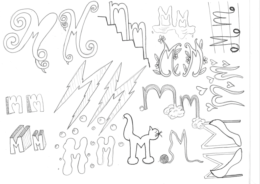
MM


This initial assignment we did in class was interesting because we were instructed to create a new set of typeface for our personal initials and act as though we were graphic designers creating a style of type for the first time. After participating in the assignment, I found that it must have been incredibly difficult and thus admirable for a graphic designer to have created a never before seen or used typeface (back in the decades when typeface design was just beginning). It was difficult enough to come up with 13 designs for two of the same letters, so I can't imagine how it was for designers back then to create an entire set of alphabetic letters in new and visually appealing typefaces. I did have fun designing my letters, though, and thought the assignment itself was helpful in our understanding of the history of typeface.             

Wednesday, April 8, 2015

Corporate Identity and Visual Systems

Corporate Identity and Visual Systems
Maggie Merkin
ARTH 230-01
T. Long


            “Good design is good business” became the phrase to live by for graphic designers during the post world war years. Productive capacity had turned toward consumer goods, and many artists and people in general believed in the possibility of unending economic expansion and prosperity. Corporate entities saw this as the time to invest in the skills and talent of good graphic designers to design their strong, corporate logos. This would enhance their image and identity for diverse audiences, as design was seen as a major way to enhance a reputation and express to possible clientele that a certain corporation was reliable and of great quality. Visual identification systems began to really take off in the 1950’s, and many post-war visual identifications for specific corporations were made possible by the efforts of strong individual designers who put their personal tastes and styles into the designed images. Today, one such corporation has seen the various styles and design aesthetics applied to their own logo. Apple Inc. has had an iconic symbol for its corporation, the apple. While there are many theories as to why the logo is an apple, one I particularly enjoyed hearing and learning about was the logo having attributions to Alan Turing, the man who laid the foundations for the modern day computer during the world wars. He is credited with pioneering research into artificial intelligence and for unlocking German wartime codes. Turing is said to have committed suicide by biting into an apple that he had laced with cyanide, after experiencing heart-wrenching humiliation for his homosexuality, facing charges and jail time for gross indecency, and receiving no recognition for his work. While there is no confirmation for the inspiration behind the apple, it was designed and drawn by Rob Janoff. The reason for the bite, according to Janoff, is strictly due to scale: it was put in to distinguish a small apple from a cherry. The various designs of the Apple Logo throughout the years are fun and iconic; just as various generations have grown up with the evolving technology, so have they grown up with an ever-evolving design for the logo. From rainbow apples to plain, white, simple apples, the logo has remained particularly iconic and prominent today.


Rainbow Version

 Current Version

 Logo Timeline

 Aqua Version

 Computer Decal

 Monochrome Version

Monday, April 6, 2015

The New York School

The New York School
Maggie Merkin
ARTH 230-01
T. Long

            Modern design in America really began when talented European artists immigrated to the U.S., seeking to escape the political totalitarianism in their homelands. The 1940s saw the beginnings of an American approach to modern design: while they borrowed from the work of these European artists, they also added their own new forms and concepts. This American kind of design was pragmatic, intuitive, and less formal than the more highly structured and theoretical work done by the Europeans. Designers and artists during this time found themselves in a highly competitive society, in which originality of concept, novelty of technique, and ability to communicate information directly were aspects that the general public and commissioners were looking for and most intrigued by. Personal expression and uniqueness was also something that was sought out for in design, making the field that much more competitive. These aspects of design were applied to almost every field in art, including editorial design. Editorial design in the 1940’s was particularly demanding, as only a few American magazines were well designed. Three of these magazines were Fortune, a business magazine, Vogue, a style and fashion magazine, and Harper’s Bazaar. The 1950s saw a period of revolution in editorial design, spurred in part by the classes that photographer Alexey Brodovitch (art director for Harper’s Bazaar) continued to teach. Expansive, design-oriented artists were mentored and instructed by Brodovitch, including Otto Storch, Brooklyn born artist and art director. Storch (1913-1999), graduated from the Pratt institute, and later studied at NYU and the Art Students League. After his schooling, Storch became art director for Dell, but, unsatisfied with his work assignments, he found himself attending some of Brodovitch’s classes at the New School. After seeing his portfolio, Brodovitch advised him to quit his job, and, taking his advice, a seven-year period of free-lancing followed. Storch later joined McCall’s Corporation as assistant art director for Better Living magazine. In 1958 Storch was free to give an upgrade to the magazine’s graphics, and a new creative visual approach was created, ranking Storch as a major innovator of the period. His philosophy that idea, copy art, and typography should be inseparable in editorial design had a heavy influence in both editorial and advertising graphics. Austrian born, American graphic designer and photographer Henry Wolf (1925-2005) was also a student of Brodovitch. He was born into a Jewish family in Vienna, Austria, and relocated to the U.S. in 1941, where he joined the army and later launched his own photography studio in New York. He became art director for the magazine Esquire in 1953, redesigning the magazine’s format, placing greater emphasis on the use of white space and large photographs. Wolf influenced and energized the magazine with his bold layouts, whimsical cover photos, and elegant typography, and his talents secured him a spot as successor art director for Harper’s Bazaar and Alexey Brodovitch. The sophistication and inventiveness of the photography that was commissioned for Harper’s Bazaar under Wolf were monumental achievements and heavily influential to editorial design. The late 1960’s saw a decline in the need for large pages, huge photographs, and graphic design in editorial magazines, as television and the demand for other types of magazines took over. However, the graphic design and artistic talents of these artists proved to be very influential and monumental to this era of editorial design.


 Henry Wolf, cover for Harper's Bazaar, 1959

 Henry Wolf, cover for Harper's Bazaar, 1958

 Henry Wolf, cover for Harper's Bazaar, 1959

 Henry Wolf, cover for Harper's Bazaar, 1959

 Henry Wolf, cover for Esquire, 1954

 Otto Storch, pages from McCall's, 1961

 Otto Storch, pages from McCall's, 1959

 Otto Storch, pages from McCall's, 1965

 Otto Storch, pages from McCall's

 Otto Storch, pages from McCall's


Tuesday, March 31, 2015

The Modern Movement In America and the International Typographic Style

The Modern Movement in America and the International Typographic Style: The War Years and After the War
Maggie Merkin
ARTH 230-01
T. Long

            The World War years saw many foreign governments struggle with disruptions in their ability to produce sufficient graphic war propaganda. To counteract this, several painters, illustrators, and designers were able to receive commissions from the U.S. Office of War Information, producing graphics ranging from colorful, eye-catching posters, to informational or training materials/manuals and even amateur cartoons. In 1941 America’s entry into the world wars was becoming more and more inevitable, so the federal government began to promote the increasing need to produce by creating and commissioning propaganda posters. Notably, one of the more famous production propaganda posters that was created during this time was by Jean Carlu, a French graphic designer who started his career as a professional poster-designer in 1919. The Cubist movement and artists such as Juan Gris and Albert Gleizes greatly influenced him. He had been commissioned by Charles Coiner (an art consultant to the federal government) to create a propaganda design. Carlu’s design, entitled “America’s answer! Production!” had over one hundred thousand copies distributed throughout the country. The work of Carlu and other prominent designers consisted of intense feelings toward Hitler, Pearl Harbor, and the war in general, and as a result of these feelings, posters that were commissioned were extremely powerful in their communication. Commercial, illustrative artist John Atherton (1900-52) was born in Brainard, Minnesota on June 7th. After a brief service in the U.S. Navy during WWI, he began to study the fine arts. Atherton expressed his feelings and thoughts toward loose talk, gossip, and careless discussions of the movement of troops and other sources of enemy information, in his poster designs. Edward McKnight Kauffer (1890-1954) was commissioned to produce designs that would boost the overall morale of the Allied nations, while Ben Shahn (1898-1969), the social realist, created posters that suggested the brutality of the Nazis. These artists and their particular designs were able to communicate their own opinions and attitudes toward the wars to the general public, while also successfully creating posters and pieces to promote the war. After World War II, the U.S demobilized millions of troops and converted industry from wartime needs to consumer markets. The Container Corporation of America (CCA) sought another institutional advertising campaign in the fine arts, commissioning paintings from artists of each of the then 48 states. Once the artists were chosen, they were allowed to freely express their own artistic convictions. The state campaign would express the same ideas of the Bauhaus: the union of art with life. After this state campaign, the CCA developed another brilliant advertising campaign, in which they asked for artists to present their various ideas and opinions centered on Western culture. The beginning of February 1950 saw an unprecedented amount of advertising in fine art, with ideas about liberty, justice, and human rights being conveyed to audiences of business leaders, employees, and investors. This campaign lasted for nearly three decades, with 157 visual artists contributing and creating artwork for almost two hundred “Great Ideas” advertisements, with art ranging from paintings to sculpture and even collage. While the CCA set a standard for excellent advertising campaigns, multiple designers and photographers remained prominent in their magazine work. Alexey Brodovitch (1898-1971) was a Russian born photographer, designer, and instructor who helped identify new talent for various magazine powerhouses. Some of his protégés included photographers Richard Avedon (1923-2004) and Irving Penn (1917-2009), who received early commissions and advice from Brodovitch. Another prominent photographer and artist, Herbert Matter (1907-1984) received freelance design commissions from the CCA, as well as commissions from clients such as Vogue, Fortune, and Harpers’ Bazaar. Overall, the years during and after the great World Wars saw much production and artistic achievement, as well as commentary and graphic communication that reached audiences everywhere.

 Jean Carlu, poster for the Office of Emergency Management 1941
 John Atherton, poster for the U.S. Office of War Information 1943
Ben Shahn, "Poster 1930S"
 Ben Cunningham, CCA advertisement honoring Nevada, 1949
 Alexey Brodovitch, cover for Portfolio, 1951
 Herbert Matter, poster for Pontresina, 1935